SITE SURVEY • AUDIENCE RESEARCH • BRAND IDENTITY • EXPERIENCE DESIGN • SIGN DESIGN

Photo: University of Portland

I conducted a survey amongst current University of Portland students and alumni, and found that people had a hard time navigating the campus because of the school’s inconsistent signage system. Students reported having trouble especially during move-in, before they got the lay of the land on their own.
The University has a brand style guide, but the guidelines are rarely applied as directed when it comes to campus signage. Inconsistent use of color and type, plus confusing placement, cause confusion for students and visitors to the campus.

The University’s current logo.

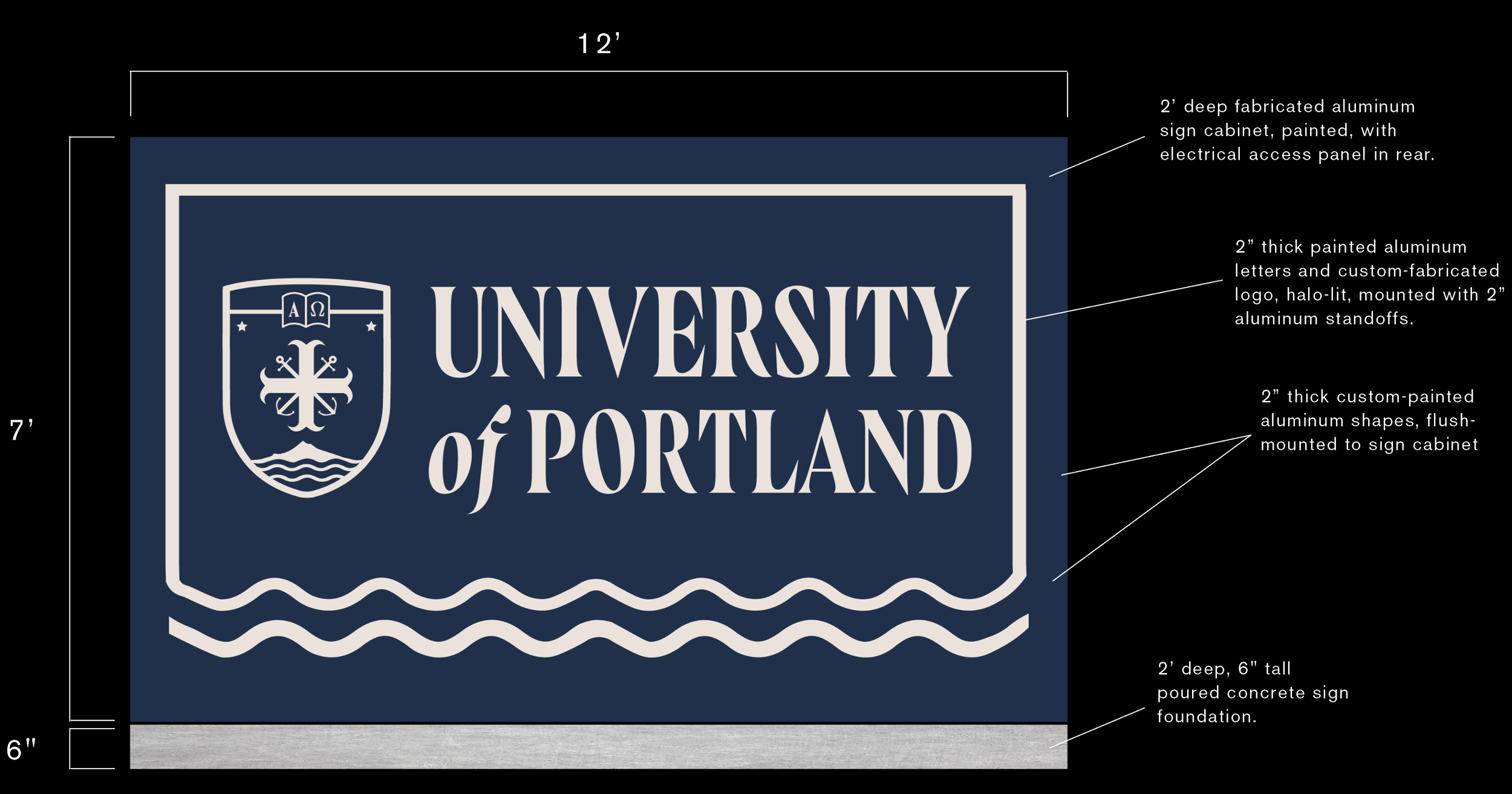
I reimagined the wordmark and shield logo to look more modern while retaining the traditional feel.


Existing building signage features inconsistent use of color and type.

Reimagined building sign, bracket-mounted to the face of each building for maximum visibility.


